In light of the recent plagiarism scandal surrounding the 2020 Tokyo Olympics logo, some concerned Japanese netizens have offered their professional help for a replacement logo. Another bunch of netizens, who are creative in their own ways, decided to compete to see who could make the plainest* (or ugliest?) possible emblem for the Tokyo Olympics.
The first attempts published on Twitter were rather mild (Twitter handle below images):


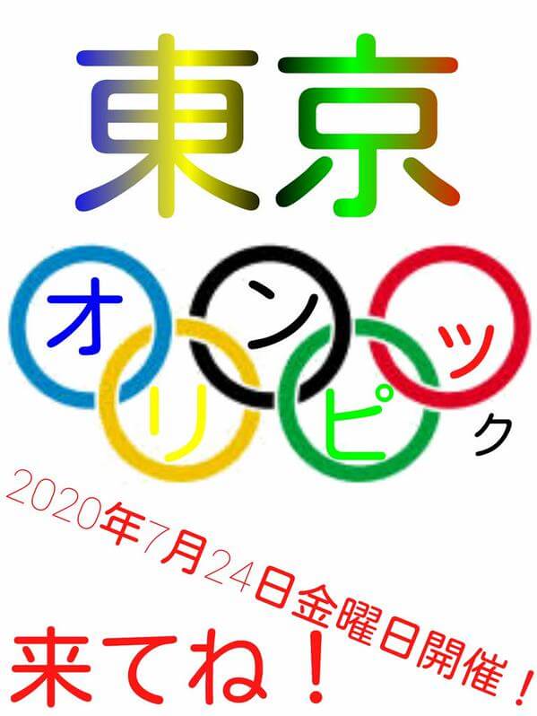
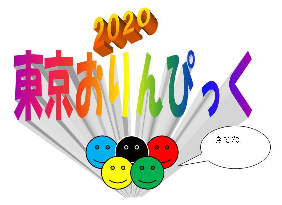
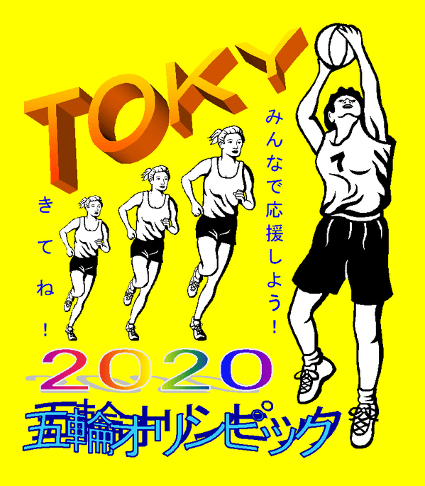
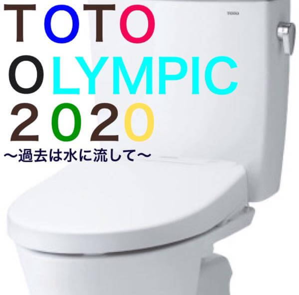
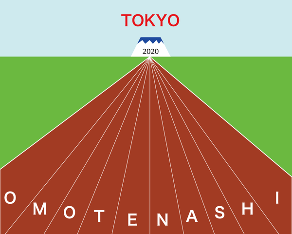
Then someone had the brilliant idea of using the ancient craft of Microsoft WordArt and it started to go from bad to worse:

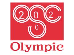
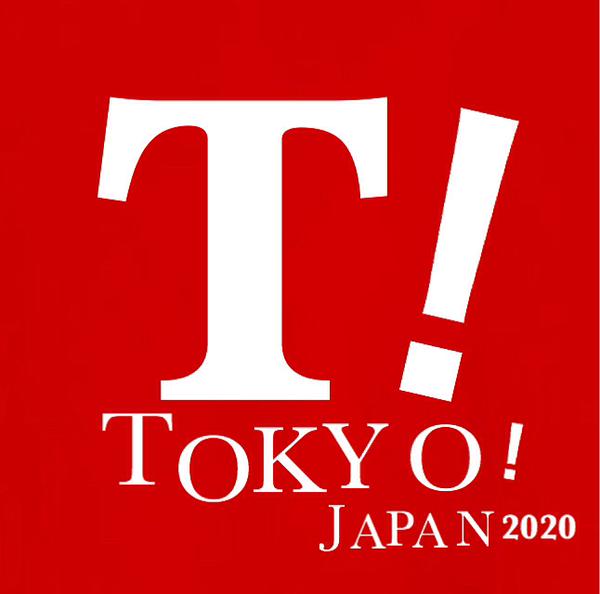
Some decided that the winning formula was to use existing logos… and how better to start than with the chain store with the same name (Olympic):
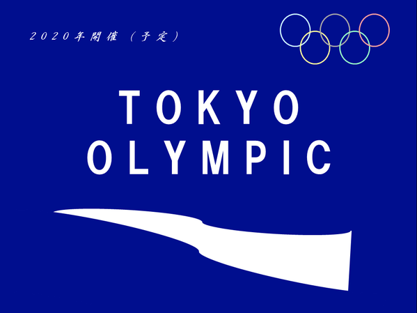
To be fair, some users still had minimum standards:
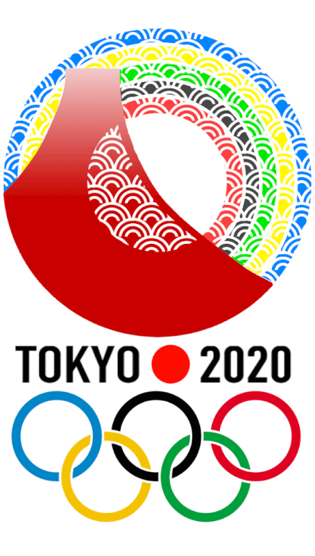
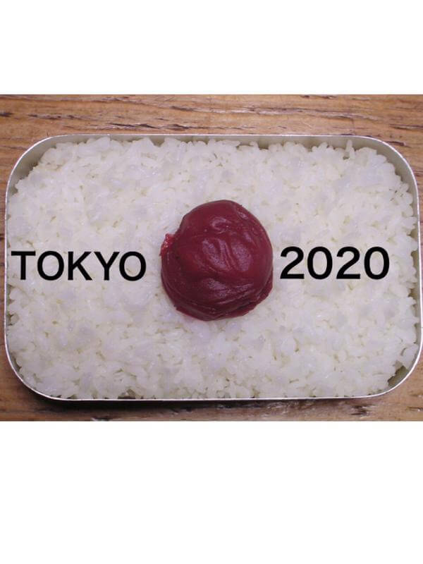
And this has gotta be the winner:
What do you think?